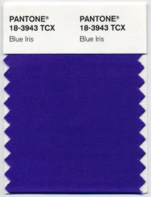
The colour of the year 2018 is ultra violet
Ultra violet promotes healing and expression – it energises and inspires. A dramatically provocative and thoughtful purple shade, PANTONE 18-3838 Ultra Violet relates originality, ingenuity and visionary thinking (a favourite colour of the architect Frank Lloyd Wright) that points us toward the new future.
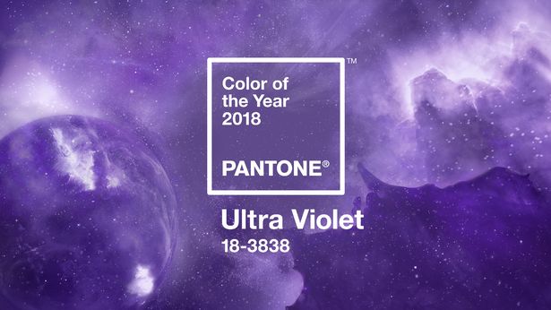
Colour of the year 2018 – Ultra Violet
Ultra violet is a complex and simply contemplative colour at the same time. It’s complex “because it takes two shades that are seemingly diametrically opposed — blue and red — and brings them together to create something new.” Ultra Violet implies the mysteries of the cosmos, the support discoveries to go beyond where we are now. It is symbolic of infinite possibilities as the skies above us.
“The Pantone Color of the Year has come to mean so much more than ‘what’s trending’ in the world of design; it’s truly a reflection of what’s needed in our world today.” – Laurie Pressman, Vice President of the Pantone Color Institute